I Saw The Sunbeams - 2025

For my grad film, I started to build a story around backgrounds. Like before, I wanted my skills in background design to be the strong point of my animation, so that is where I started.
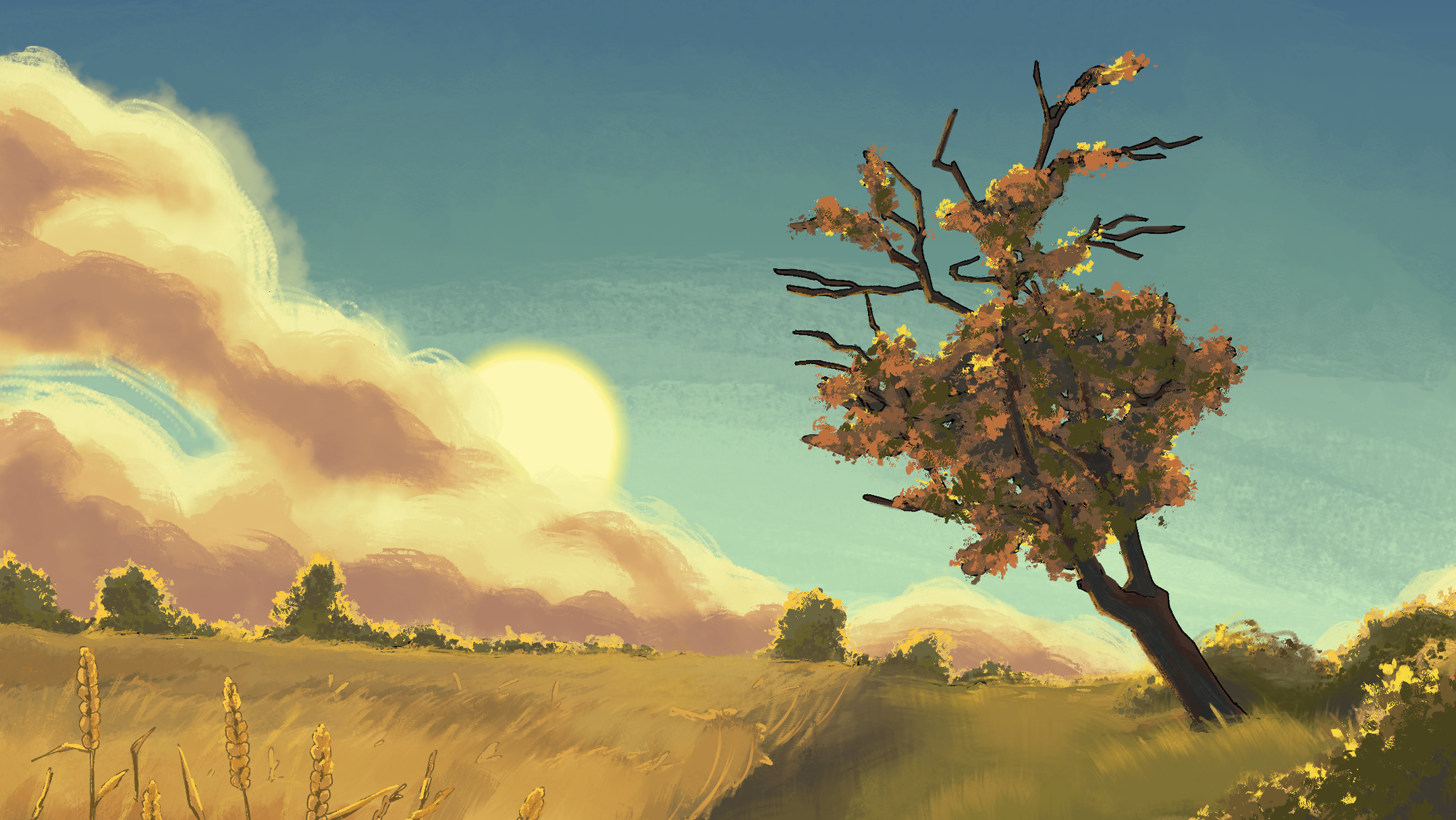
The story was slightly based on my home village and thus almost all the backgrounds were inspired by compositions I'd often see when taking my dog for their walk. (With some embellishments).
After some time the film became a bit of a love letter to my home village and what it used to be for me when I was a kid, and how I didn't take advatage of the wide open spaces I had availble to me back then- and now how I am losing it all to land development. Eventually however the film's story grew more personal around our main character Hayes.
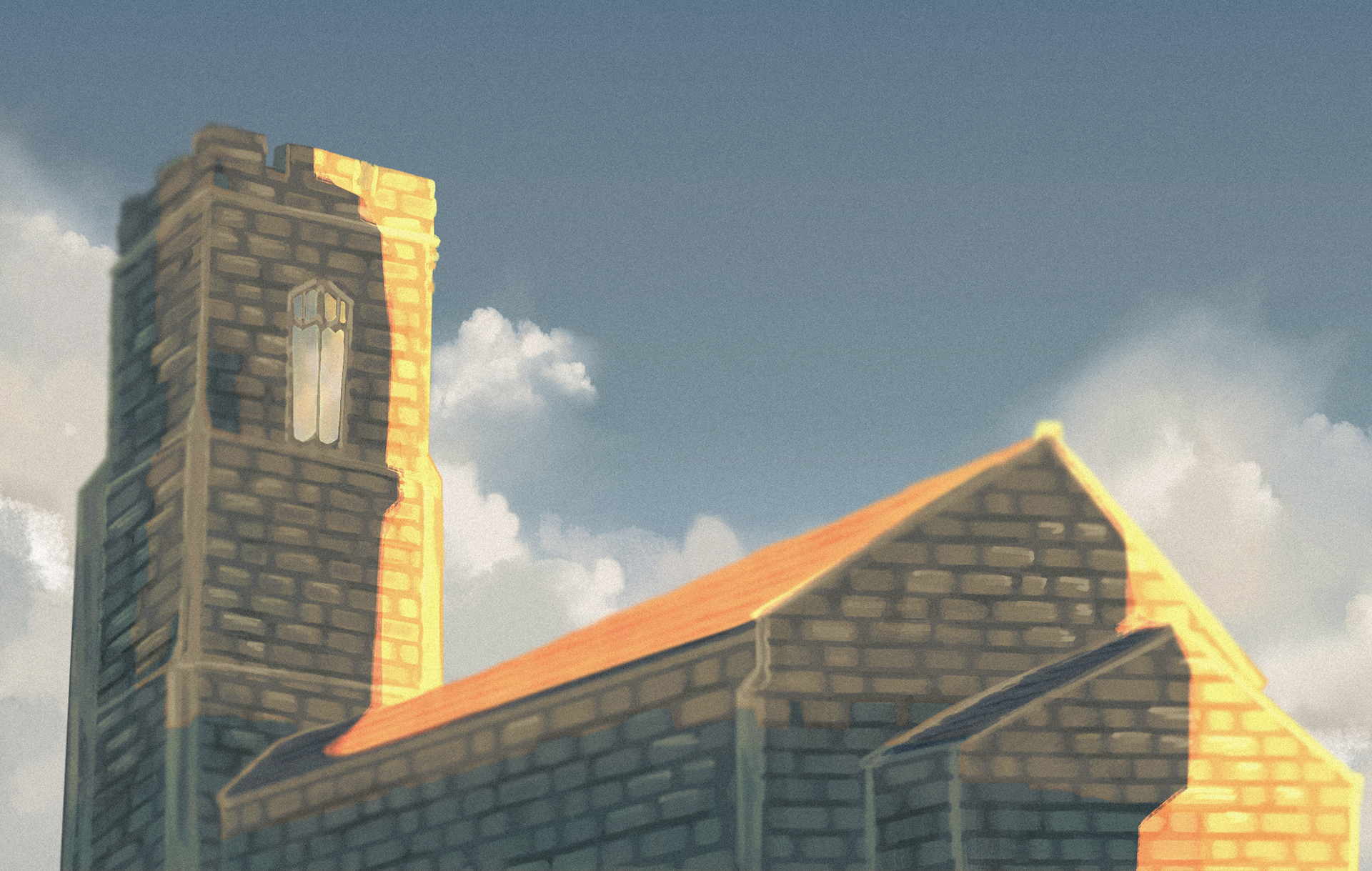
Below are some work-in-progress shots of how I worked on one of my backgrounds.


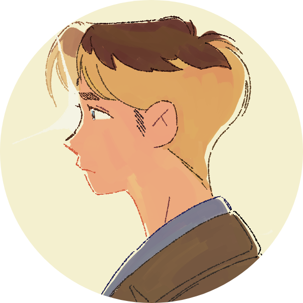
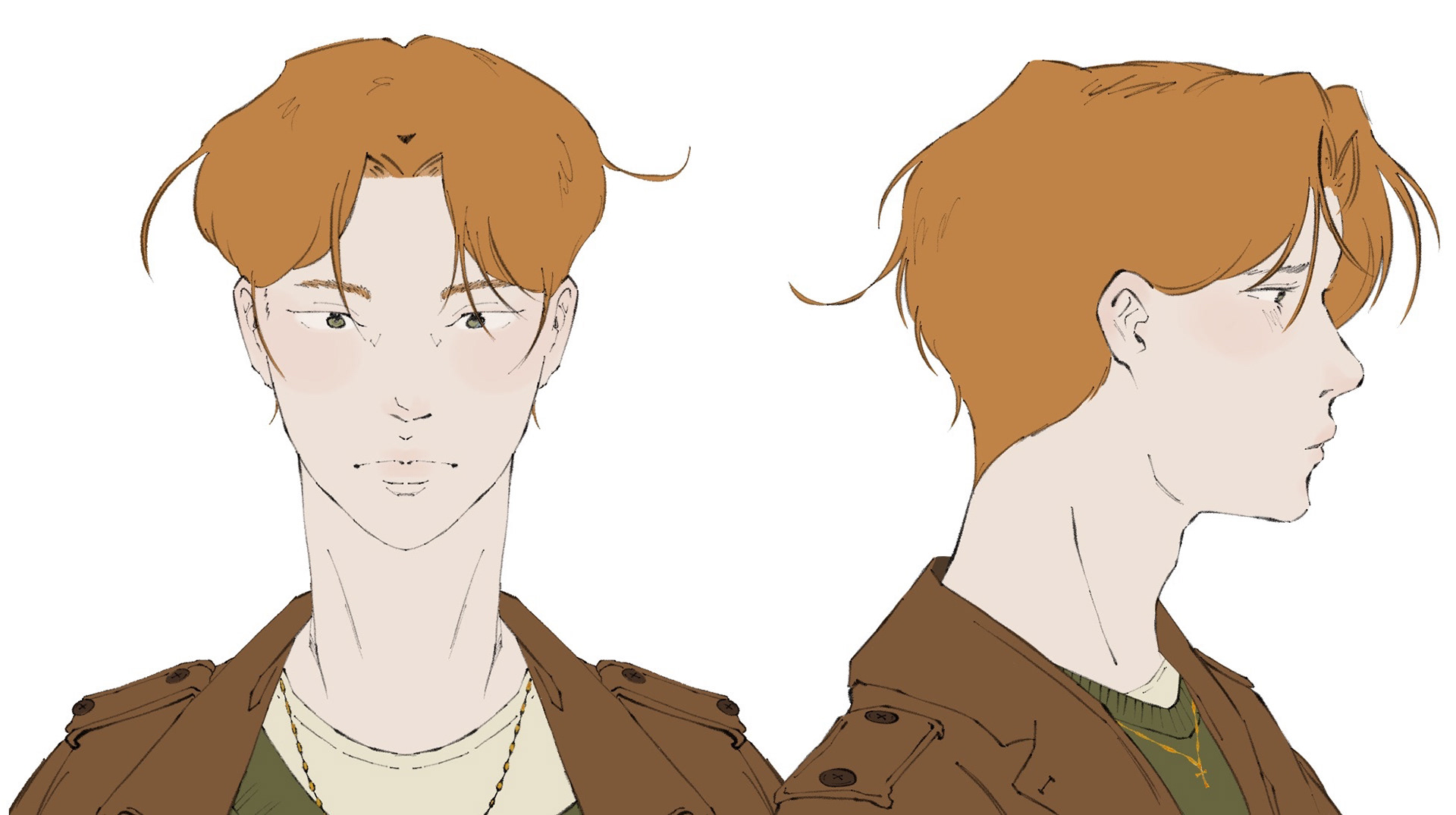
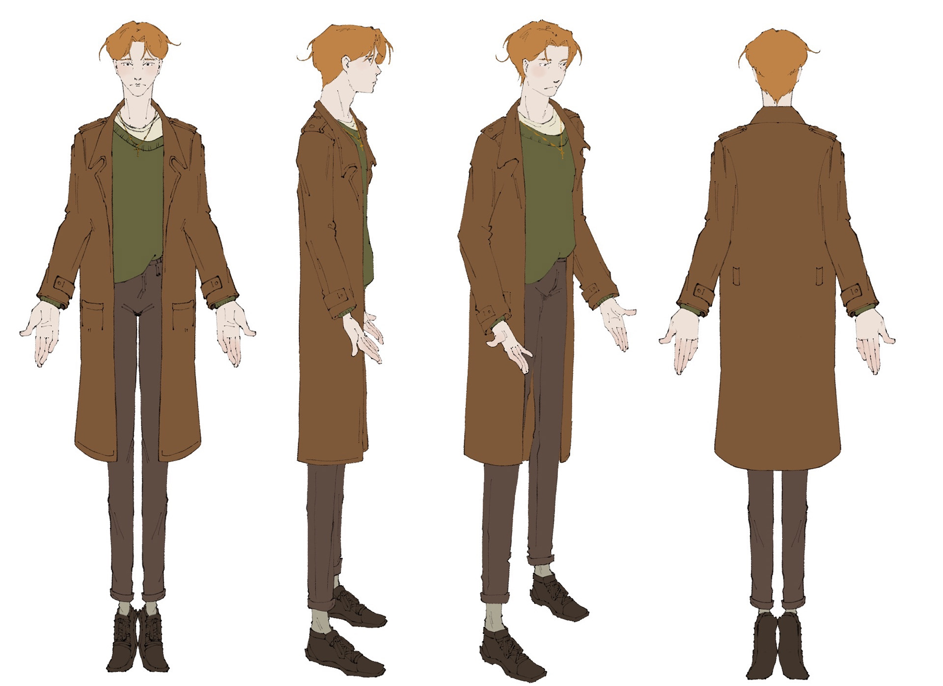
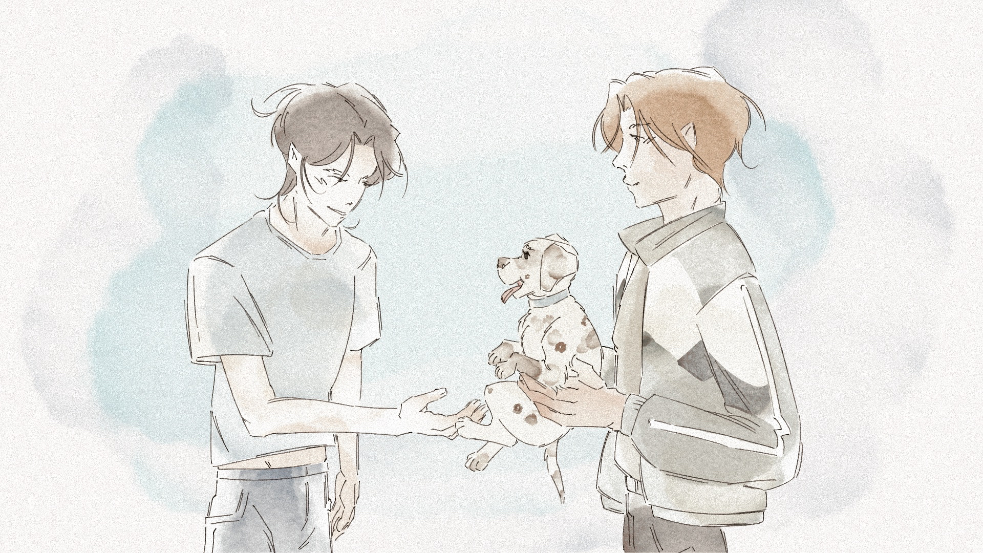
Hayes' development. Upon starting this film I already had the character idea of Hayes so I didn't need to spend a lot of time refining his design but more so understanding what kind of clothes he wears. After a lot of variation I settled on the idea that he wears very earthy warm tones. Making him seem a very down to earth and solid character.


His story focuses a lot on his past. Hayes is a trans man who struggles to look back on his childhood in a good light, and so when it came to finally chosing the colours for kid Hayes I went with purple.
The colour is strikingly different from the green to make that part of his life stand out while also complementing the green enough to make the colour palette harmonious. The youngest version of him wears both colours to identify being comfortable with who they currently are and can be, whereas the older kid is dressed only in purple to show forced femininity they are not comfortable with. This is in contrast with his next life stage being almost completely green, a silent form of rebellion. While his palette then softens out with an overall brown theme, it still shows that he has not reconciled with his past.
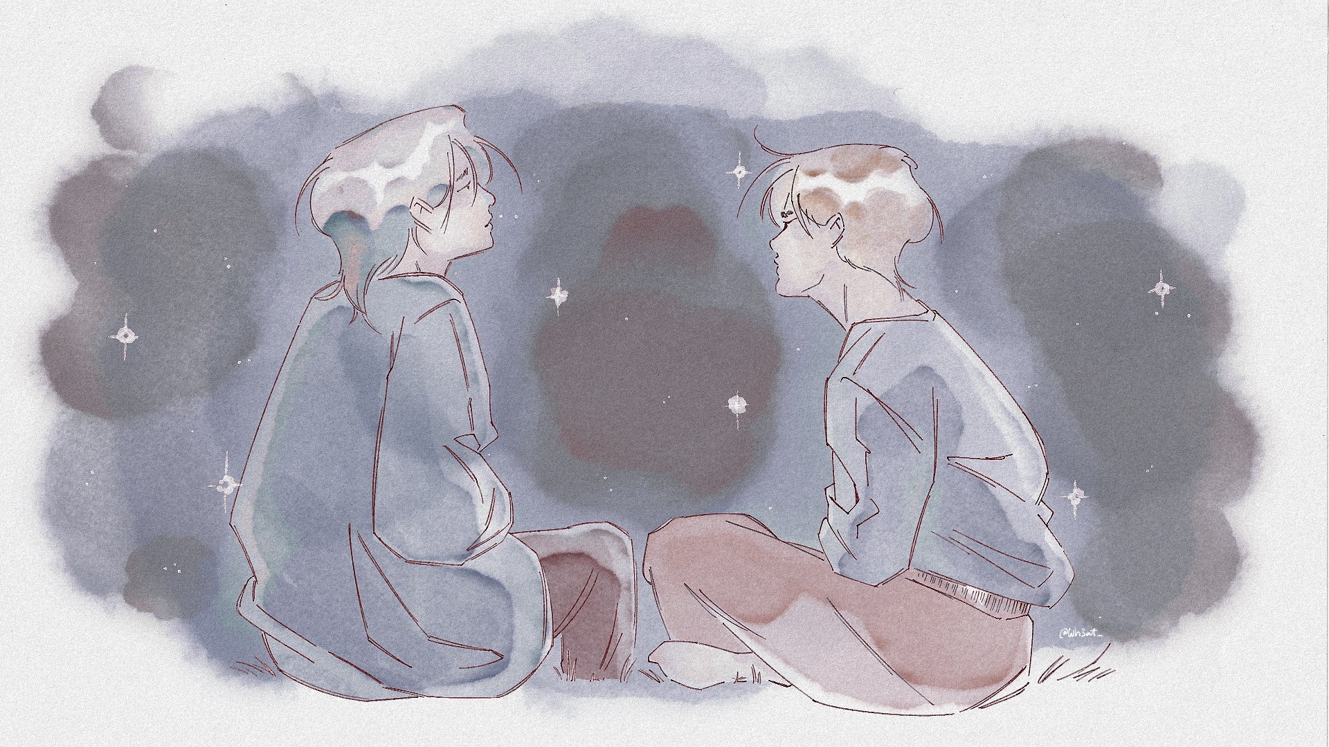
In the film, we see memories of the good parts of Hayes' life at home, drawn in a watercolour style to highlight them.
The softness of the style is meant to invoke that feeling of looking back on pleasant memories and not being able to see them as clearly as you once could.


Backgrounds


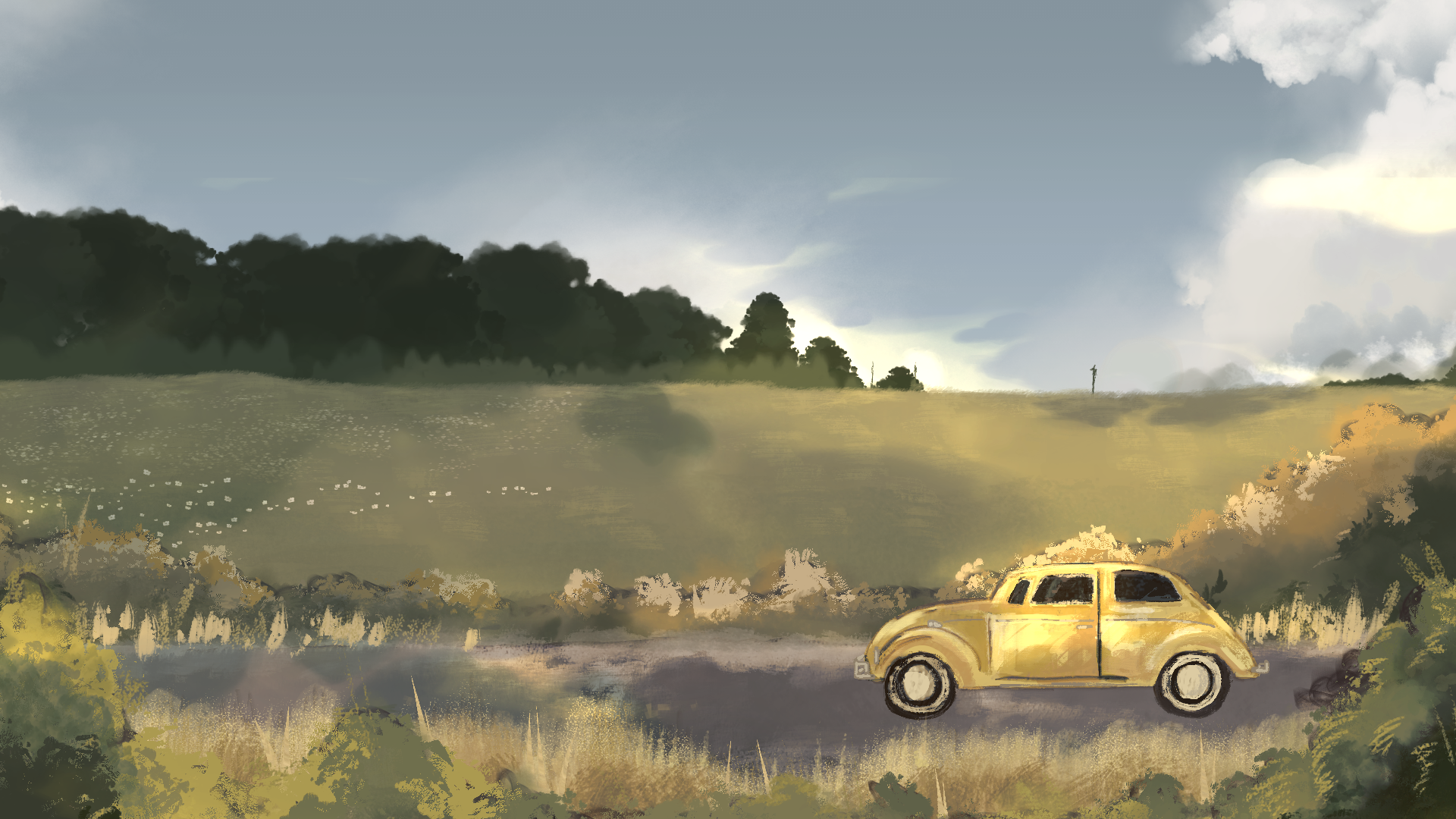
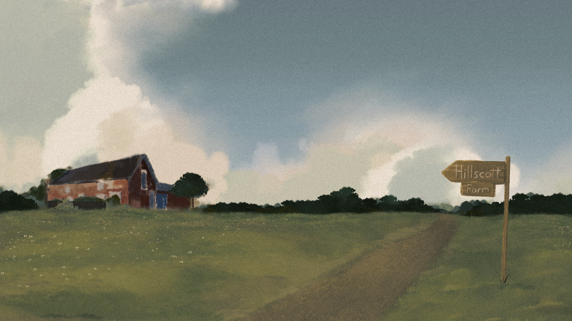


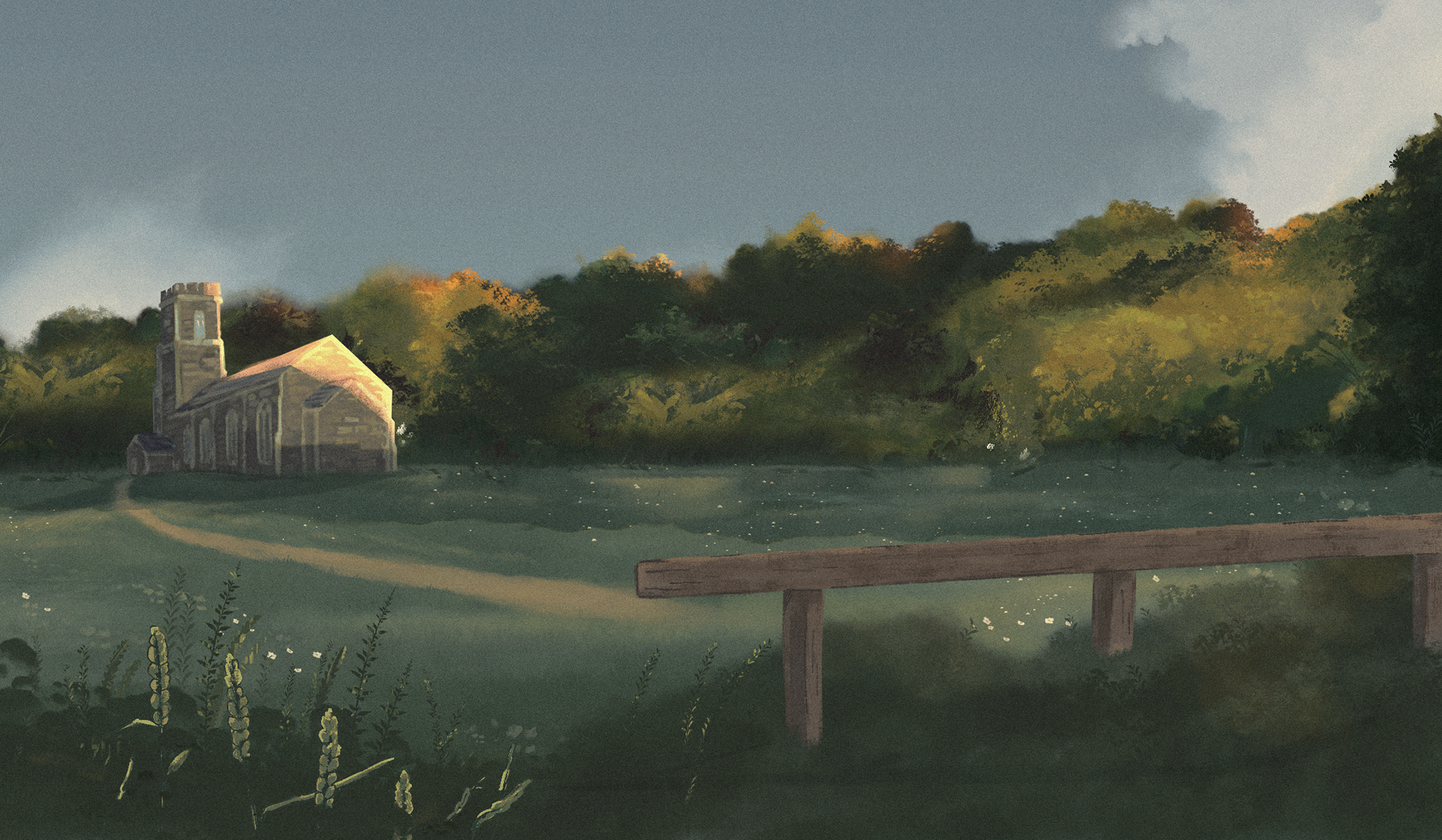

While making the backgrounds, I decided I'd use a subtle colour script change as the story goes on, the warm oranges and greens slowly taper out into cool greens and blues as Hayes revisits his past and remembers more and more on why he left and what he left behind.
They took a lot of time to create, but overall paid off massively to make the film what it is, and I am very proud of the skill I am advertising in them as well.


Scrapped idea.
Originally, the story was going to take place in the heart of the city and focus more on a love and acceptance story with another character than on Hayes' own acceptance of himself.